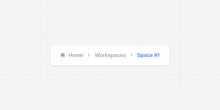
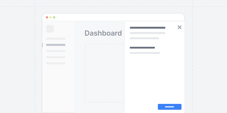
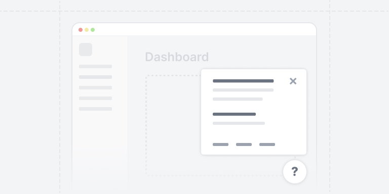
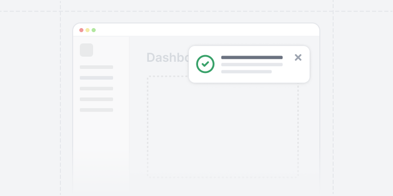
Beautiful MUI Building Blocks
UI Foundations Kit provides 65 well-designed, copy-and-pasteable React components that work seamlessly with MUI v5. Build your next app without worrying about layouts or CSS, and tweak whatever you want.
import * as React from "react"// MUI v5 componentsimport { Box, IconButton, LinearProgress, Typography } from "@mui/material"import { TbEditCircle, TbPin, TbShare, TbShoe } from "react-icons/tb"// Stat card with progress barexport default function StatProgress({children,}: {children?: React.ReactNode}) {return (<Boxsx={{display: "flex",flexDirection: "column",bgcolor: "background.paper",borderRadius: 1,p: 3,borderWidth: 1,borderStyle: "solid",borderColor: "gray.200",width: "100%",maxWidth: 480,}}><Boxsx={{display: "flex",flexDirection: "row",justifyContent: "space-between",mb: 2,}}><Boxsx={{display: "flex",flexDirection: "row",alignItems: "center",gap: 1.5,}}><Boxsx={{display: "flex",alignItems: "center",justifyContent: "center",color: "primary.500",bgcolor: "primary.100",borderRadius: 1,height: 36,width: 36,}}><TbShoe size={20} /></Box><Boxsx={{display: "flex",flexDirection: "column",}}><Typography variant="h2">Step challenge</Typography><Typographysx={{color: "gray.500",fontSize: "sm",lineHeight: 1,}}>20k per day</Typography></Box></Box><Box><IconButton><TbShare /></IconButton><IconButton><TbEditCircle /></IconButton><IconButton color="primary"><TbPin /></IconButton></Box></Box><Boxsx={{display: "flex",flexDirection: "row",justifyContent: "space-between",mb: 0.5,}}><Typographysx={{fontSize: "sm",color: "gray.500",}}>Progress</Typography><Typographysx={{fontSize: "sm",color: "gray.500",}}>46%</Typography></Box><Box><LinearProgressvalue={46}variant="determinate"sx={{height: 10,borderRadius: 1,}}/></Box><Boxsx={{display: "flex",flexDirection: "row",alignItems: "center",justifyContent: "space-between",mt: 1,}}><Typographysx={{fontSize: "md",fontWeight: 500,color: "gray.700",}}>9,200{" "}<Boxcomponent="span"sx={{fontSize: "xs",color: "gray.500",}}>/ 20,000</Box></Typography><Boxcomponent="span"sx={{display: "flex",alignItems: "center",height: "max-content",px: 1,py: 0,fontSize: "xs",fontWeight: 600,color: "yellow.700",bgcolor: "yellow.100",borderRadius: 1,textTransform: "uppercase",}}>11 hours left</Box></Box></Box>)}
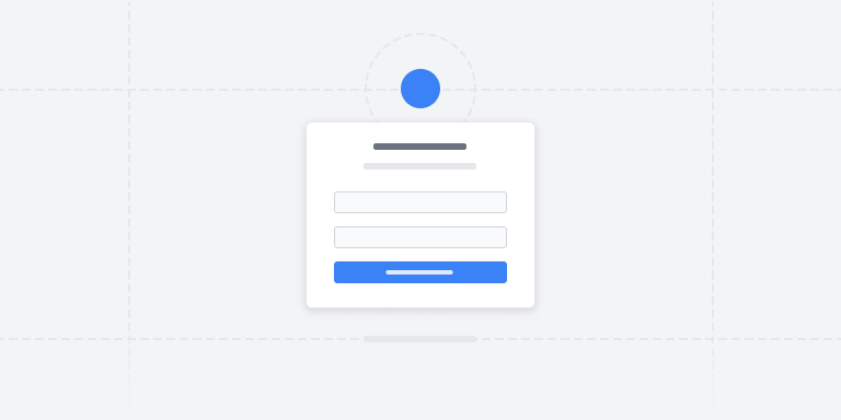
Step challenge
20k per day
Progress
46%
9,200 / 20,000
11 hours leftBeautiful default theme
Powered by harmonic scales and high-level utility abstractions like Tailwind and Styled System.Fully responsive
Supports all shapes and mobile sizes ergonomically built with the responsive object syntax.Completely themeable
TypeScript defined theme tokens, variants, and scales, or vanilla JavaScript if that's your thing.Modern techniques
Grid and flex native, using modern, supported syntax & properties like gap + layout components.Application Kit
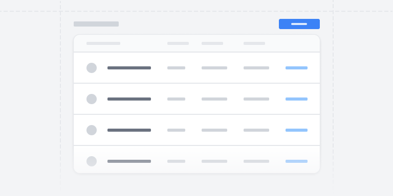
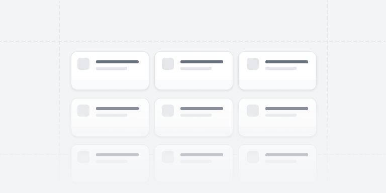
61 components

Frequently Asked Questions
Yes, almost everything you see on this site is built with the same components that are offered through the library, as well as the same theme.
All components are written with the MUI Material package, on version 5 or greater.
Version 5 brought support for the sx prop and theming provided by the widely popular emotion package.
UI is the most popular React component library in the world.With as extensive of APIs provides, you can build extremely complex business applications with fewer lines of code.
Other libraries offer great alternatives, as well as novel approaches to styling, but MUI has continued to provide the most sophisticated components like Autocompletes and Data Grids with a consistent API.
For the time being, no. As the library matures we will reconsider that decision, but the current resources for Joy UI are less extensive and less tested.
Because of the large collection of components that the MUI Material library provides, we support it first and foremost.
New components and sections are actively added to the UI Foundations Kit library. Free updates means you get access to all future additions.
If prices are raised, you get all upgrades at no additional cost.
After you have purchased a license through our payment provider, you will receive an email from them confirming your purchasing. In addition, you will receive an email from UI Foundations inviting you to the platform.
The email address used at purchase is the same one that will allow you to login and access uifoundations.com and kit.uifoundations.com
The source code for Pro components is provided to you on the website, just as you would find if for free components, but you will need to be logged in to access it.
The Team license allows all employees (and/or contractors) of the licensee to access and use the components. When purchasing a team license, we recommend using an email address with shared credentials all team members can access.
Feel free to contact support with any questions as it relates to team licenses.
No, though we do offer a variety of free components that you can use to explore the various design decisions made for various components.