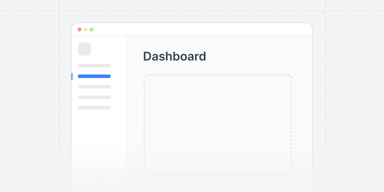
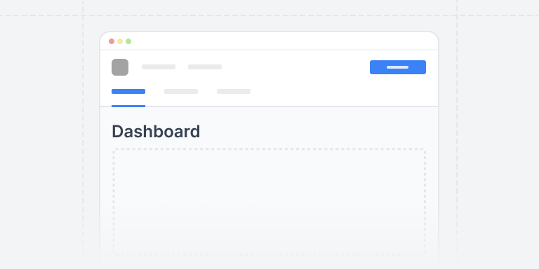
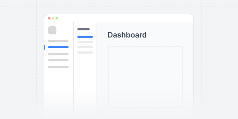
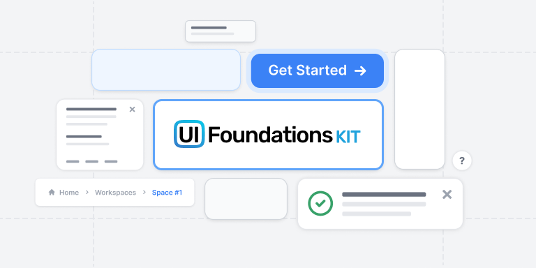
Beautiful MUI Building Blocks
UI Foundations Kit provides 82 well-designed, copy-and-pasteable React components that work seamlessly with MUI. Build your next app without worrying about layouts or CSS, and tweak whatever you want.
import * as React from "react"// MUI v5 componentsimport { Box, IconButton, LinearProgress, Typography } from "@mui/material"import { TbEditCircle, TbPin, TbShare, TbShoe } from "react-icons/tb"// Stat card with progress barexport default function StatProgress({children,}: {children?: React.ReactNode}) {return (<Boxsx={{display: "flex",flexDirection: "column",bgcolor: "background.paper",borderRadius: 1,p: 3,borderWidth: 1,borderStyle: "solid",borderColor: "gray.200",width: "100%",maxWidth: 480,}}><Boxsx={{display: "flex",flexDirection: "row",justifyContent: "space-between",mb: 2,}}><Boxsx={{display: "flex",flexDirection: "row",alignItems: "center",gap: 1.5,}}><Boxsx={{display: "flex",alignItems: "center",justifyContent: "center",color: "primary.500",bgcolor: "primary.100",borderRadius: 1,height: 36,width: 36,}}><TbShoe size={20} /></Box><Boxsx={{display: "flex",flexDirection: "column",}}><Typography variant="h2">Step challenge</Typography><Typographysx={{color: "gray.500",fontSize: "sm",lineHeight: 1,}}>20k per day</Typography></Box></Box><Box><IconButton><TbShare /></IconButton><IconButton><TbEditCircle /></IconButton><IconButton color="primary"><TbPin /></IconButton></Box></Box><Boxsx={{display: "flex",flexDirection: "row",justifyContent: "space-between",mb: 0.5,}}><Typographysx={{fontSize: "sm",color: "gray.500",}}>Progress</Typography><Typographysx={{fontSize: "sm",color: "gray.500",}}>46%</Typography></Box><Box><LinearProgressvalue={46}variant="determinate"sx={{height: 10,borderRadius: 1,}}/></Box><Boxsx={{display: "flex",flexDirection: "row",alignItems: "center",justifyContent: "space-between",mt: 1,}}><Typographysx={{fontSize: "md",fontWeight: 500,color: "gray.700",}}>9,200{" "}<Boxcomponent="span"sx={{fontSize: "xs",color: "gray.500",}}>/ 20,000</Box></Typography><Boxcomponent="span"sx={{display: "flex",alignItems: "center",height: "max-content",px: 1,py: 0,fontSize: "xs",fontWeight: 600,color: "yellow.700",bgcolor: "yellow.100",borderRadius: 1,textTransform: "uppercase",}}>11 hours left</Box></Box></Box>)}
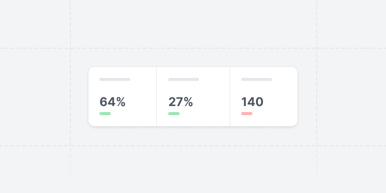
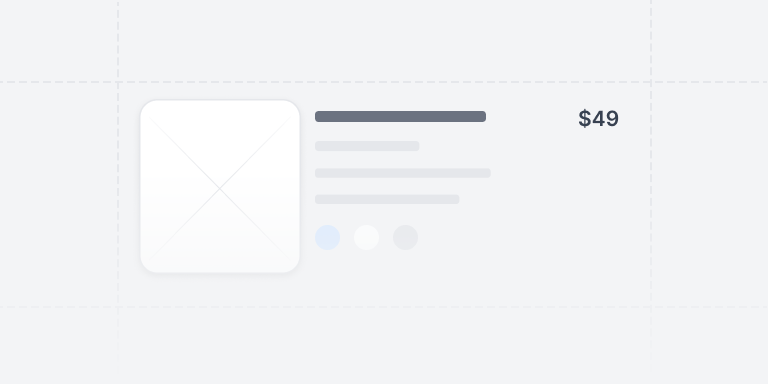
Step challenge
20k per day
Progress
46%
9,200 / 20,000
11 hours leftBeautiful default theme
Powered by harmonic scales and high-level utility abstractions like Tailwind and Styled System.Fully responsive
Supports all shapes and mobile sizes ergonomically built with the responsive object syntax.Completely themeable
TypeScript defined theme tokens, variants, and scales, or vanilla JavaScript if that's your thing.Modern techniques
Grid and flex native, using modern, supported syntax & properties like gap + layout components.Application Kit
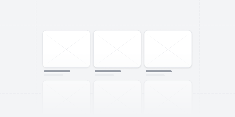
72 components
Ecommerce Kit
3 components
Frequently Asked Questions
Yes, almost everything you see on this site is built with the same components that are offered through the library, as well as the same theme.
All components are written with the MUI Material package, on version 6 or greater.
Version 5 brought support for the sx prop and theming provided by the widely popular emotion package, and is a core part of the code.
UI is the most popular React component library in the world.With as extensive of APIs provides, you can build extremely complex business applications with fewer lines of code.
Other libraries offer great alternatives, as well as novel approaches to styling, but MUI has continued to provide the most sophisticated components like Autocompletes and Data Grids with a consistent API.
For the time being, no. As the library matures we will reconsider that decision, but the current resources for Joy UI are less extensive and less tested.
Because of the large collection of components that the MUI Material library provides, we support it first and foremost.
Reach out to support and we will provide you with free access to the template as well. We appreciate your early support.
After you purchase, you will be able to access the source code downloadable from the MUI store.
Refer to the MUI license terms on the store docs for more information.
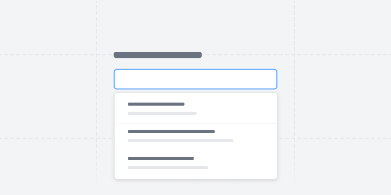
No, though you can preview components and explore them here in the UI before purchasing.